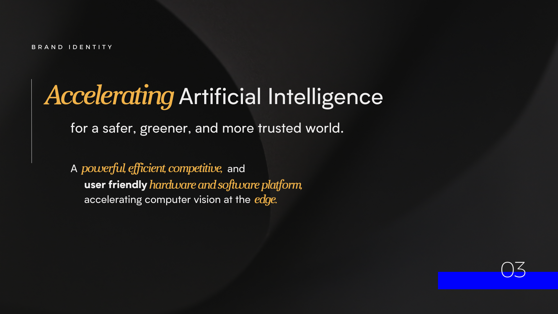
A startup seeking to revolutionize and democratize artificial intelligence with integrated software and hardware.
ROLE:
Brand Strategy & Design
Creative Direction
The process
Axelera reached out to us seeking a rebrand as they prepare for Series A funding after a very successful Seed stage. They wanted a brand that is sleek and conveys their powerful streamlined efficiency visually. We worked closely with the CEO to fine tune the brand story, identify the core characteristics, and unearth the visual identity through color and texture. We wanted the brand to feel like an Italian sports car - sleek, sexy, powerful, and elegant.
Research & Inspiration
Axelera wants to stand out from its competition, so we looked at the other semiconductor and AI chip companies in the sector and identified how they presented their value propositions and core offerings, and how to best craft Axelera’s message from that niche.
Branding in the AI world is very futurism and tech centric, so we wanted to bring some warmth to the brand by incorporating the shade of yellow that was a signature of Bitfury (Axelera’s main parent company at the time), along with human centric language.
Iterations
They wanted to try out some different logo concepts, so after some sketches and experimentation with isometric shapes and lettering, we settled on a graphic facelift of the letters AX, iterating on line weight and proportions until we were all satisfied with color combinations and word marks.
Branding
The Axelera brand is masculine, dark themed, with a mixture of tech and organic textures that speak to the integration of both software and hardware in their AI system. Everything about the brand is sleek yet bold: colors are monochromatic shades of charcoal grey and silver, with accents of a gold version of the Bitfury yellow, and a striking electric blue. The brand voice is straightforward and straight-shooting - the tech speaks for itself and is designed for B2B, so the language is full of AI jargon.
We also made some close-up chip graphics for them to use, since part of their core offering is the hardware itself. The client wanted dramatic, cropped, macro shots of data and chip boards, so we made these mockups using our new logo and refreshed brand colors.


